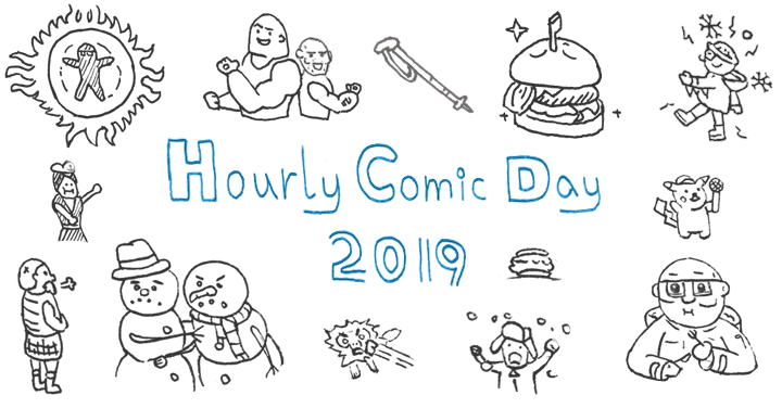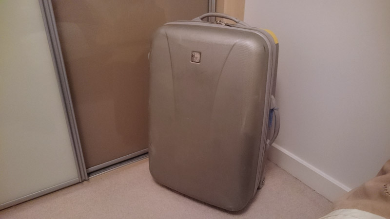
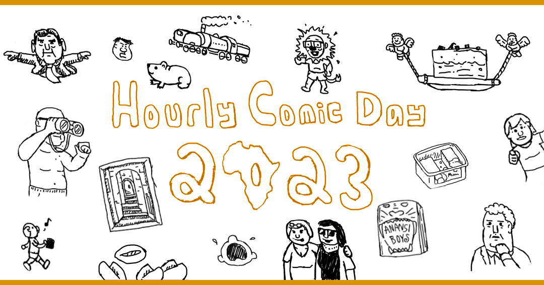
I present to you this year’s diary comic, chronicling the 1st February 2023 in celebration of Hourly Comic Day (in spirit if not timeliness*). It features a nice change of scenery (and excuse for the delay), as this year I was on holiday! South Africa, visiting family and seeing the sights!
After last year’s rescheduling, cancellations, and test requests, it was nice to actually get out there in the sun! Until the flights were delayed, and our luggage went missing for a few days… it all worked out in the end! *forced grin*
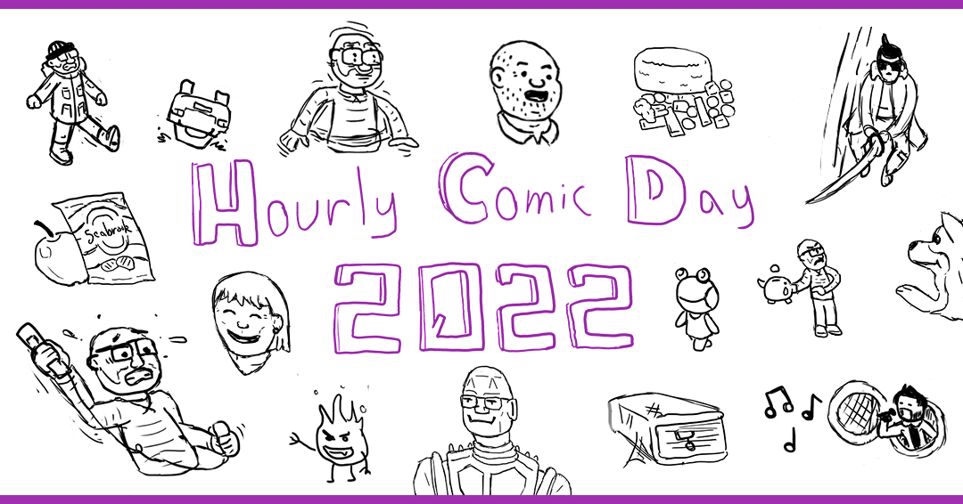
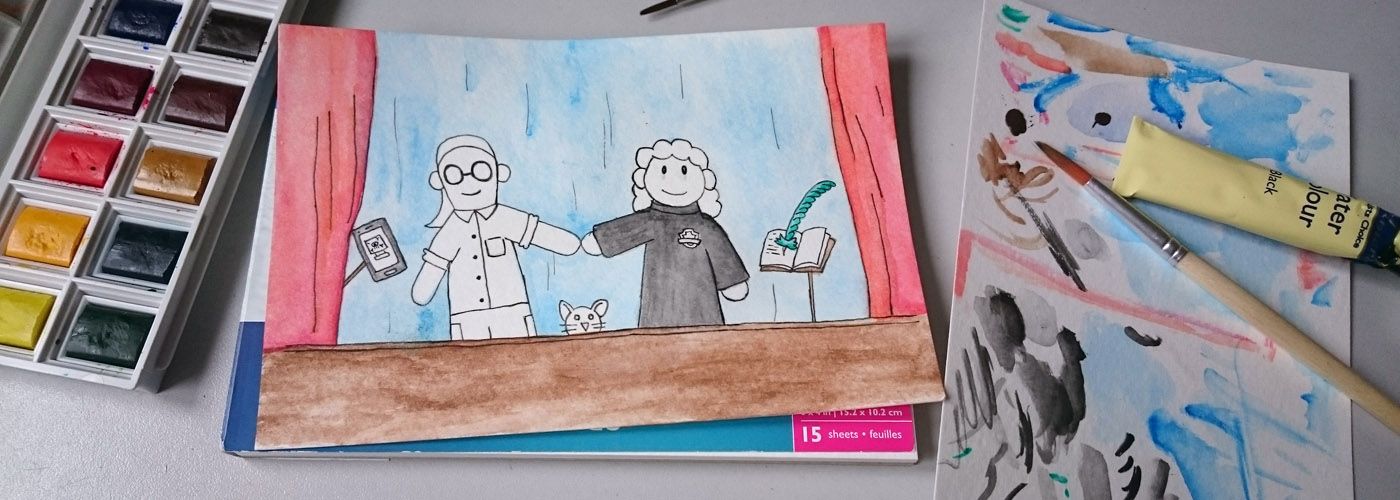
This year’s diary comic can be viewed through the link below.
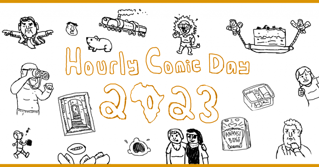
Diary Comic – Hourly Comic Day 2023
*Usual HCD disclaimer: These are not drawn on the hour, every hour, on the day itself. I don’t know how some people ever do that.
Instagram: #HourlyComicDay
Footnotes
- This is the trip that I was supposed to be going on last year, (to see Ex-Pat family), before all the semi-Covid delays, cancellations, tests and rules broke me down.
- Dassies (AKA Rock Hyrax) are little Groundhog / Meerkat / Guinea Pig things.
- The gallery paintings / sculptures were by Ken Maloney. While very impressive, they wouldn’t fit in my suitcase… especially not when many of them cost four figures.
- “Load Shedding” is their term for “scheduled power cuts”. Not great, but you get a schedule app so you can prepare around those couple hours a day.
- I read Anansi Boys in ‘record time’ (under a month)! Set in the world of American Gods, but with more levity and less road trip padding. They’re making a TV series too… let’s hope it actually gets finished, unlike the American Gods show.
- Peppermint Tart is a delicacy that’s hard to come by outside of SA, because primary ingredient Peppermint Crisp falls foul of the dairy export ban.
- Yes, Midsomer Murders ended with a big explosion. The Lions of Causton. Look it up.
- Post-credits reference: I’ve still not watched Wednesday yet. Oh, and you’re welcome.